The radio button is a common tool used to select a single option among multiple choices within a dialog box. In part two of this series, we will be covering the radio button and taking the mystery out of the “group box” and the operation of automatic radio buttons. In addition, the combo box will also be examined as an alternative.
Friday, March 22. 2019
LDC #128: Checkbox and Radio Button Controls Part 2
Options, Options and More Options
In part one, I covered the idea of single and multiple user selections for various options. As a developer, we have the option of checkboxes, radio buttons, combo boxes and list boxes. The multiple selection scheme was covered in the first part of this series using two scripts to accomplish the same task with different user experiences and program structure. However, there are many occasions where the user should only select one of multiple options. This could include situations where you may want a user to choose a format for text where only one choice can be applied or select a single characteristic among a group where the options are logically and mutually exclusive. In these cases, checkboxes and list boxes aren’t the best choice, as they are designed to allow multiple selection. A radio button is a better approach.
The Radio Button
Radio buttons differ from checkboxes in that visually they are expected to operate actual “radio” buttons or presets. You press ‘1’ is the preset loads “K-Rock 94.5 FM” on your car radio, for example. Generally, the operator only presses one button at any given time, and only one station can be loaded at a time.
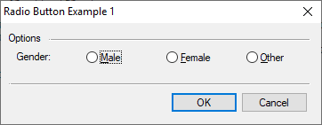
Here is a simple radio button example:
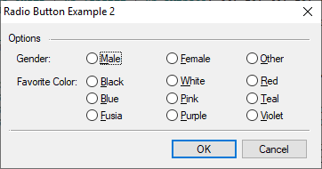
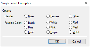
Something a little more complicated with two groups:
In most cases, we like to avoid unnecessary coding, so we use auto option for radio buttons (and checkboxes). If we do not use the auto feature, code for each control must be written to respond to click (or spacebar) hits. Now, with example 1, auto operation is simple: When ‘Other’ is pressed the ‘Male’ and ‘Female’ buttons are reset. When clicked, the activated control automatically looks around for companion radio button controls and automatically resets them. This works nicely until there are two or more sets of controls such as shown in example 2.
The resource code for example 1:
RadioButtonExample01Dlg DIALOGEX 0, 0, 240, 70
EXSTYLE WS_EX_DLGMODALFRAME
STYLE DS_MODALFRAME | DS_3DLOOK | WS_POPUP | WS_VISIBLE | WS_CAPTION | WS_SYSMENU
CAPTION "Radio Button Example 1"
FONT 8, "MS Shell Dlg"
{
 CONTROL "Options", -1, "static", SS_LEFT | WS_CHILD | WS_VISIBLE, 6, 6, 30, 8, 0
 CONTROL "", -1, "static", SS_ETCHEDFRAME | WS_CHILD | WS_VISIBLE, 36, 11, 196, 1
 CONTROL "Gender:", -1, "static", SS_LEFT | WS_CHILD | WS_VISIBLE, 12, 19, 60, 8, 0
 CONTROL "&Male", RB_GENDER_MALE, "button", BS_AUTORADIOBUTTON | WS_CHILD | WS_VISIBLE | WS_TABSTOP, 64, 18, 40, 12, 0
 CONTROL "&Female", RB_GENDER_FEMALE, "button", BS_AUTORADIOBUTTON | WS_CHILD | WS_VISIBLE | WS_TABSTOP, 124, 18, 40, 12, 0
 CONTROL "&Other", RB_GENDER_OTHER, "button", BS_AUTORADIOBUTTON | WS_CHILD | WS_VISIBLE | WS_TABSTOP, 184, 18, 40, 12, 0
 CONTROL "", -1, "static", SS_ETCHEDFRAME | WS_CHILD | WS_VISIBLE, 6, 42, 226, 1
 CONTROL "OK", IDOK, "button", BS_DEFPUSHBUTTON | WS_CHILD | WS_VISIBLE | WS_TABSTOP, 127, 48, 50, 14, 0
 CONTROL "Cancel", IDCANCEL, "button", BS_PUSHBUTTON | WS_CHILD | WS_VISIBLE | WS_TABSTOP, 180, 48, 50, 14, 0
}
To segregate the ‘Gender’ choices from the ‘Favorite Color’ choices, we have to indicate the start of control groups. Looking at the resource code:
RadioButtonExample02Dlg DIALOGEX 0, 0, 240, 100
EXSTYLE WS_EX_DLGMODALFRAME
STYLE DS_MODALFRAME | DS_3DLOOK | WS_POPUP | WS_VISIBLE | WS_CAPTION | WS_SYSMENU
CAPTION "Radio Button Example 2"
FONT 8, "MS Shell Dlg"
{
 CONTROL "Options", -1, "static", SS_LEFT | WS_CHILD | WS_VISIBLE, 6, 6, 30, 8, 0
 CONTROL "", -1, "static", SS_ETCHEDFRAME | WS_CHILD | WS_VISIBLE, 36, 11, 196, 1
 CONTROL "Gender:", -1, "static", SS_LEFT | WS_GROUP | WS_CHILD | WS_VISIBLE, 12, 20, 60, 8, 0
 CONTROL "&Male", RB_GENDER_MALE, "button", BS_AUTORADIOBUTTON | WS_CHILD | WS_VISIBLE | WS_TABSTOP, 64, 18, 40, 13, 0
 CONTROL "&Female", RB_GENDER_FEMALE, "button", BS_AUTORADIOBUTTON | WS_CHILD | WS_VISIBLE | WS_TABSTOP, 124, 18, 40, 13, 0
 CONTROL "&Other", RB_GENDER_OTHER, "button", BS_AUTORADIOBUTTON | WS_CHILD | WS_VISIBLE | WS_TABSTOP, 184, 18, 40, 13, 0
 CONTROL "Favorite Color:", -1, "static", SS_LEFT | WS_GROUP | WS_CHILD | WS_VISIBLE, 12, 36, 60, 8, 0
 CONTROL "&Black", RB_COLOR_BLACK, "button", BS_AUTORADIOBUTTON | WS_CHILD | WS_VISIBLE | WS_TABSTOP, 64, 34, 40, 13, 0
 CONTROL "&White", RB_COLOR_WHITE, "button", BS_AUTORADIOBUTTON | WS_CHILD | WS_VISIBLE | WS_TABSTOP, 124, 34, 40, 12, 0
 CONTROL "&Red", RB_COLOR_RED, "button", BS_AUTORADIOBUTTON | WS_CHILD | WS_VISIBLE | WS_TABSTOP, 184, 34, 40, 12, 0
 CONTROL "&Blue", RB_COLOR_BLUE, "button", BS_AUTORADIOBUTTON | WS_CHILD | WS_VISIBLE | WS_TABSTOP, 64, 46, 40, 12, 0
 CONTROL "&Pink", RB_COLOR_PINK, "button", BS_AUTORADIOBUTTON | WS_CHILD | WS_VISIBLE | WS_TABSTOP, 124, 46, 40, 12, 0
 CONTROL "&Teal", RB_COLOR_TEAL, "button", BS_AUTORADIOBUTTON | WS_CHILD | WS_VISIBLE | WS_TABSTOP, 184, 46, 40, 12, 0
 CONTROL "&Fusia", RB_COLOR_FUSIA, "button", BS_AUTORADIOBUTTON | WS_CHILD | WS_VISIBLE | WS_TABSTOP, 64, 58, 40, 12, 0
 CONTROL "&Purple", RB_COLOR_PURPLE, "button", BS_AUTORADIOBUTTON | WS_CHILD | WS_VISIBLE | WS_TABSTOP, 124, 58, 40, 12, 0
 CONTROL "&Violet", RB_COLOR_VIOLET, "button", BS_AUTORADIOBUTTON | WS_CHILD | WS_VISIBLE | WS_TABSTOP, 184, 58, 40, 12, 0
 CONTROL "", -1, "static", SS_ETCHEDFRAME | WS_CHILD | WS_VISIBLE, 6, 74, 226, 1
 CONTROL "OK", IDOK, "button", BS_DEFPUSHBUTTON | WS_CHILD | WS_VISIBLE | WS_TABSTOP, 127, 80, 50, 14, 0
 CONTROL "Cancel", IDCANCEL, "button", BS_PUSHBUTTON | WS_CHILD | WS_VISIBLE | WS_TABSTOP, 180, 80, 50, 14, 0
}
To mark the groups, the WS_GROUP style must be added to a control to start a group. This is a critical: the WS_GROUP style bit does not divide, it starts the group.
Without properly defined groups, radio buttons will act erratically. Let’s look at the Microsoft documentation:
“WS_GROUP Specifies the first control of a group of controls in which the user can move from one control to the next with the arrow keys. All controls defined with the WS_GROUP style FALSE after the first control belong to the same group. The next control with the WS_GROUP style starts the next group (that is, one group ends where the next begins).”
What is interesting about this paragraph is that is discusses moving with the arrow keys but it is silent on the implications for button windows with the BS_AUTORADIOBUTTON style set. The WS_GROUP can be set on any control including the first radio button in a series. However, remember each group must be started. Failing to start the first group will result in erratic behavior. I think the first dialog I created with radio buttons was with Windows 3.1 in the early 90s! Many years later, this is still not documented clearly in MSDN.
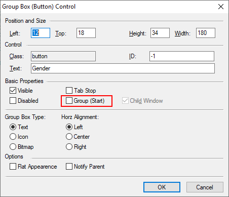
The Group Box Control — A Separate Beast
Confusion is further compounded by the developer’s interpretation of the BS_GROUPBOX style for the button class. BS_GROUPBOX creates a visual group control using a button common control class while WS_GROUP style bit is a flag set on any control.
Microsoft’s use of term group in this context is ambiguous and unfortunate. Again, Group box controls can be used to visually group controls. However, without the WS_GROUP style set, it just looks like any other control in the dialog to a auto radio button hunting for it partners during a click action.
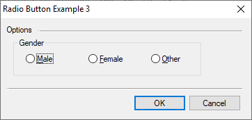
The visual group box style looks like this:
With later versions of Windows, this visual style has falling out of favor, as the grouping box is very subtle unless you force your dialogs to a light background.
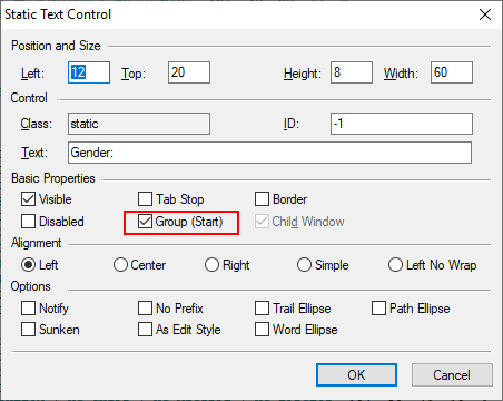
Group Style within the Legato Control Editor
The Legato IDE control editor adds a little clarity to the WS_GROUP option (this example is for a static control; press Ctrl+1 or select Script | Tools | Edit Dialog Control in the IDE to access control editing):
For the group box control:
Radio Button Examples
The code for the above examples is provided below:
                                                                        // Resource
#beginresource

#define RB_GENDER_MALE                  201
#define RB_GENDER_FEMALE                202
#define RB_GENDER_OTHER                 203
#define RB_COLOR_BLACK                  204
#define RB_COLOR_WHITE                  205
#define RB_COLOR_RED                    206
#define RB_COLOR_BLUE                   207
#define RB_COLOR_PINK                   208
#define RB_COLOR_TEAL                   209
#define RB_COLOR_FUSIA                  210
#define RB_COLOR_PURPLE                 211
#define RB_COLOR_VIOLET                 212

RadioButtonExample01Dlg DIALOGEX 0, 0, 240, 70
EXSTYLE WS_EX_DLGMODALFRAME
STYLE DS_MODALFRAME | DS_3DLOOK | WS_POPUP | WS_VISIBLE | WS_CAPTION | WS_SYSMENU
CAPTION "Radio Button Example 1"
FONT 8, "MS Shell Dlg"
{
 CONTROL "Options", -1, "static", SS_LEFT | WS_CHILD | WS_VISIBLE, 6, 6, 30, 8, 0
 CONTROL "", -1, "static", SS_ETCHEDFRAME | WS_CHILD | WS_VISIBLE, 36, 11, 196, 1
 CONTROL "Gender:", -1, "static", SS_LEFT | WS_CHILD | WS_VISIBLE, 12, 19, 60, 8, 0
 CONTROL "&Male", RB_GENDER_MALE, "button", BS_AUTORADIOBUTTON | WS_CHILD | WS_VISIBLE | WS_TABSTOP, 64, 18, 40, 12, 0
 CONTROL "&Female", RB_GENDER_FEMALE, "button", BS_AUTORADIOBUTTON | WS_CHILD | WS_VISIBLE | WS_TABSTOP, 124, 18, 40, 12, 0
 CONTROL "&Other", RB_GENDER_OTHER, "button", BS_AUTORADIOBUTTON | WS_CHILD | WS_VISIBLE | WS_TABSTOP, 184, 18, 40, 12, 0
 CONTROL "", -1, "static", SS_ETCHEDFRAME | WS_CHILD | WS_VISIBLE, 6, 42, 226, 1
 CONTROL "OK", IDOK, "button", BS_DEFPUSHBUTTON | WS_CHILD | WS_VISIBLE | WS_TABSTOP, 127, 48, 50, 14, 0
 CONTROL "Cancel", IDCANCEL, "button", BS_PUSHBUTTON | WS_CHILD | WS_VISIBLE | WS_TABSTOP, 180, 48, 50, 14, 0
}

RadioButtonExample02Dlg DIALOGEX 0, 0, 240, 100
EXSTYLE WS_EX_DLGMODALFRAME
STYLE DS_MODALFRAME | DS_3DLOOK | WS_POPUP | WS_VISIBLE | WS_CAPTION | WS_SYSMENU
CAPTION "Radio Button Example 2"
FONT 8, "MS Shell Dlg"
{
 CONTROL "Options", -1, "static", SS_LEFT | WS_CHILD | WS_VISIBLE, 6, 6, 30, 8, 0
 CONTROL "", -1, "static", SS_ETCHEDFRAME | WS_CHILD | WS_VISIBLE, 36, 11, 196, 1
 CONTROL "Gender:", -1, "static", SS_LEFT | WS_GROUP | WS_CHILD | WS_VISIBLE, 12, 20, 60, 8, 0
 CONTROL "&Male", RB_GENDER_MALE, "button", BS_AUTORADIOBUTTON | WS_CHILD | WS_VISIBLE | WS_TABSTOP, 64, 18, 40, 13, 0
 CONTROL "&Female", RB_GENDER_FEMALE, "button", BS_AUTORADIOBUTTON | WS_CHILD | WS_VISIBLE | WS_TABSTOP, 124, 18, 40, 13, 0
 CONTROL "&Other", RB_GENDER_OTHER, "button", BS_AUTORADIOBUTTON | WS_CHILD | WS_VISIBLE | WS_TABSTOP, 184, 18, 40, 13, 0
 CONTROL "Favorite Color:", -1, "static", SS_LEFT | WS_GROUP | WS_CHILD | WS_VISIBLE, 12, 36, 60, 8, 0
 CONTROL "&Black", RB_COLOR_BLACK, "button", BS_AUTORADIOBUTTON | WS_CHILD | WS_VISIBLE | WS_TABSTOP, 64, 34, 40, 13, 0
 CONTROL "&White", RB_COLOR_WHITE, "button", BS_AUTORADIOBUTTON | WS_CHILD | WS_VISIBLE | WS_TABSTOP, 124, 34, 40, 12, 0
 CONTROL "&Red", RB_COLOR_RED, "button", BS_AUTORADIOBUTTON | WS_CHILD | WS_VISIBLE | WS_TABSTOP, 184, 34, 40, 12, 0
 CONTROL "&Blue", RB_COLOR_BLUE, "button", BS_AUTORADIOBUTTON | WS_CHILD | WS_VISIBLE | WS_TABSTOP, 64, 46, 40, 12, 0
 CONTROL "&Pink", RB_COLOR_PINK, "button", BS_AUTORADIOBUTTON | WS_CHILD | WS_VISIBLE | WS_TABSTOP, 124, 46, 40, 12, 0
 CONTROL "&Teal", RB_COLOR_TEAL, "button", BS_AUTORADIOBUTTON | WS_CHILD | WS_VISIBLE | WS_TABSTOP, 184, 46, 40, 12, 0
 CONTROL "&Fusia", RB_COLOR_FUSIA, "button", BS_AUTORADIOBUTTON | WS_CHILD | WS_VISIBLE | WS_TABSTOP, 64, 58, 40, 12, 0
 CONTROL "&Purple", RB_COLOR_PURPLE, "button", BS_AUTORADIOBUTTON | WS_CHILD | WS_VISIBLE | WS_TABSTOP, 124, 58, 40, 12, 0
 CONTROL "&Violet", RB_COLOR_VIOLET, "button", BS_AUTORADIOBUTTON | WS_CHILD | WS_VISIBLE | WS_TABSTOP, 184, 58, 40, 12, 0
 CONTROL "", -1, "static", SS_ETCHEDFRAME | WS_CHILD | WS_VISIBLE, 6, 74, 226, 1
 CONTROL "OK", IDOK, "button", BS_DEFPUSHBUTTON | WS_CHILD | WS_VISIBLE | WS_TABSTOP, 127, 80, 50, 14, 0
 CONTROL "Cancel", IDCANCEL, "button", BS_PUSHBUTTON | WS_CHILD | WS_VISIBLE | WS_TABSTOP, 180, 80, 50, 14, 0
}

RadioButtonExample03Dlg DIALOGEX 0, 0, 240, 90
EXSTYLE WS_EX_DLGMODALFRAME
STYLE DS_MODALFRAME | DS_3DLOOK | WS_POPUP | WS_VISIBLE | WS_CAPTION | WS_SYSMENU
CAPTION "Radio Button Example 3"
FONT 8, "MS Shell Dlg"
{
 CONTROL "Options", -1, "static", SS_LEFT | WS_CHILD | WS_VISIBLE, 6, 6, 30, 8, 0
 CONTROL "", -1, "static", SS_ETCHEDFRAME | WS_CHILD | WS_VISIBLE, 36, 11, 196, 1
 CONTROL "Gender", -1, "button", BS_GROUPBOX | WS_CHILD | WS_VISIBLE, 12, 18, 180, 34, 0
 CONTROL "&Male", RB_GENDER_MALE, "button", BS_AUTORADIOBUTTON | WS_CHILD | WS_VISIBLE | WS_TABSTOP, 24, 30, 40, 12, 0
 CONTROL "&Female", RB_GENDER_FEMALE, "button", BS_AUTORADIOBUTTON | WS_CHILD | WS_VISIBLE | WS_TABSTOP, 84, 30, 40, 12, 0
 CONTROL "&Other", RB_GENDER_OTHER, "button", BS_AUTORADIOBUTTON | WS_CHILD | WS_VISIBLE | WS_TABSTOP, 144, 30, 40, 12, 0
 CONTROL "", -1, "static", SS_ETCHEDFRAME | WS_CHILD | WS_VISIBLE, 6, 62, 226, 1
 CONTROL "OK", IDOK, "button", BS_DEFPUSHBUTTON | WS_CHILD | WS_VISIBLE | WS_TABSTOP, 127, 68, 50, 14, 0
 CONTROL "Cancel", IDCANCEL, "button", BS_PUSHBUTTON | WS_CHILD | WS_VISIBLE | WS_TABSTOP, 180, 68, 50, 14, 0
}


#endresource

                                                                        // Main Entry
int main() {
    DialogBox("RadioButtonExample01Dlg", "rb_");
    return ERROR_NONE;
    }
Simply change the example in the DialogBox function from 1 to 2 or 3 to view the above examples in operation.
A Little Selection Program
Our radio button example operates a lot like our checkbox example. Here is the example dialog:
Here is the code:
                                                                        // Resource
#beginresource

#define RB_GENDER_MALE                  201
#define RB_GENDER_FEMALE                202
#define RB_GENDER_OTHER                 203
#define RB_COLOR_BLACK                  204
#define RB_COLOR_WHITE                  205
#define RB_COLOR_RED                    206
#define RB_COLOR_BLUE                   207
#define RB_COLOR_PINK                   208
#define RB_COLOR_TEAL                   209
#define RB_COLOR_FUSIA                  210
#define RB_COLOR_PURPLE                 211
#define RB_COLOR_VIOLET                 212

RadioButtonExample02Dlg DIALOGEX 0, 0, 240, 100
EXSTYLE WS_EX_DLGMODALFRAME
STYLE DS_MODALFRAME | DS_3DLOOK | WS_POPUP | WS_VISIBLE | WS_CAPTION | WS_SYSMENU
CAPTION "Single Select Example 2"
FONT 8, "MS Shell Dlg"
{
 CONTROL "Options", -1, "static", SS_LEFT | WS_CHILD | WS_VISIBLE, 6, 6, 30, 8, 0
 CONTROL "", -1, "static", SS_ETCHEDFRAME | WS_CHILD | WS_VISIBLE, 36, 11, 196, 1
 CONTROL "Gender:", -1, "static", SS_LEFT | WS_GROUP | WS_CHILD | WS_VISIBLE, 12, 20, 60, 8, 0
 CONTROL "&Male", RB_GENDER_MALE, "button", BS_AUTORADIOBUTTON | WS_CHILD | WS_VISIBLE | WS_TABSTOP, 64, 18, 40, 13, 0
 CONTROL "&Female", RB_GENDER_FEMALE, "button", BS_AUTORADIOBUTTON | WS_CHILD | WS_VISIBLE | WS_TABSTOP, 124, 18, 40, 13, 0
 CONTROL "&Other", RB_GENDER_OTHER, "button", BS_AUTORADIOBUTTON | WS_CHILD | WS_VISIBLE | WS_TABSTOP, 184, 18, 40, 13, 0
 CONTROL "Favorite Color:", -1, "static", SS_LEFT | WS_GROUP | WS_CHILD | WS_VISIBLE, 12, 36, 60, 8, 0
 CONTROL "&Black", RB_COLOR_BLACK, "button", BS_AUTORADIOBUTTON | WS_CHILD | WS_VISIBLE | WS_TABSTOP, 64, 34, 40, 13, 0
 CONTROL "&White", RB_COLOR_WHITE, "button", BS_AUTORADIOBUTTON | WS_CHILD | WS_VISIBLE | WS_TABSTOP, 124, 34, 40, 12, 0
 CONTROL "&Red", RB_COLOR_RED, "button", BS_AUTORADIOBUTTON | WS_CHILD | WS_VISIBLE | WS_TABSTOP, 184, 34, 40, 12, 0
 CONTROL "&Blue", RB_COLOR_BLUE, "button", BS_AUTORADIOBUTTON | WS_CHILD | WS_VISIBLE | WS_TABSTOP, 64, 46, 40, 12, 0
 CONTROL "&Pink", RB_COLOR_PINK, "button", BS_AUTORADIOBUTTON | WS_CHILD | WS_VISIBLE | WS_TABSTOP, 124, 46, 40, 12, 0
 CONTROL "&Teal", RB_COLOR_TEAL, "button", BS_AUTORADIOBUTTON | WS_CHILD | WS_VISIBLE | WS_TABSTOP, 184, 46, 40, 12, 0
 CONTROL "&Fusia", RB_COLOR_FUSIA, "button", BS_AUTORADIOBUTTON | WS_CHILD | WS_VISIBLE | WS_TABSTOP, 64, 58, 40, 12, 0
 CONTROL "&Purple", RB_COLOR_PURPLE, "button", BS_AUTORADIOBUTTON | WS_CHILD | WS_VISIBLE | WS_TABSTOP, 124, 58, 40, 12, 0
 CONTROL "&Violet", RB_COLOR_VIOLET, "button", BS_AUTORADIOBUTTON | WS_CHILD | WS_VISIBLE | WS_TABSTOP, 184, 58, 40, 12, 0
 CONTROL "", -1, "static", SS_ETCHEDFRAME | WS_CHILD | WS_VISIBLE, 6, 74, 226, 1
 CONTROL "OK", IDOK, "button", BS_DEFPUSHBUTTON | WS_CHILD | WS_VISIBLE | WS_TABSTOP, 127, 80, 50, 14, 0
 CONTROL "Cancel", IDCANCEL, "button", BS_PUSHBUTTON | WS_CHILD | WS_VISIBLE | WS_TABSTOP, 180, 80, 50, 14, 0
}

#endresource


                                                                        // Dialog Data
    string              rb_gender;
    string              rb_color;

                                                                        // Main Entry
int main() {
    int                 rc;

    rb_gender = GetSetting("Dialog Examples", "Single Select Options", "Gender");
    rb_color  = GetSetting("Dialog Examples", "Single Select Options", "Color");

    rc = DialogBox("RadioButtonExample02Dlg", "rb_");
    if (IsNotError(rc))  {
      PutSetting("Dialog Examples", "Single Select Options", "Gender", rb_gender);
      PutSetting("Dialog Examples", "Single Select Options", "Color", rb_color);
      MessageBox("Gender: %s\r\rColor: %s", rb_gender, rb_color);
      }
    return rc;
    }

                                                                        // In Dialog Proc - Load
int rb_load() {

    if (rb_gender == "Male") {
      CheckboxSetState(RB_GENDER_MALE);
      }
    if (rb_gender == "Female") {
      CheckboxSetState(RB_GENDER_FEMALE);
      }
    if (rb_gender == "Other") {
      CheckboxSetState(RB_GENDER_OTHER);
      }

    if (rb_color == "Black") {
      CheckboxSetState(RB_COLOR_BLACK);
      }
    if (rb_color == "White") {
      CheckboxSetState(RB_COLOR_WHITE);
      }
    if (rb_color == "Red") {
      CheckboxSetState(RB_COLOR_RED);
      }
    if (rb_color == "Blue") {
      CheckboxSetState(RB_COLOR_BLUE);
      }
    if (rb_color == "Pink") {
      CheckboxSetState(RB_COLOR_PINK);
      }
    if (rb_color == "Teal") {
      CheckboxSetState(RB_COLOR_TEAL);
      }
    if (rb_color == "Fusia") {
      CheckboxSetState(RB_COLOR_FUSIA);
      }
    if (rb_color == "Purple") {
      CheckboxSetState(RB_COLOR_PURPLE);
      }
    if (rb_color == "Violet") {
      CheckboxSetState(RB_COLOR_VIOLET);
      }

    return ERROR_NONE;
    }

                                                                        // In Dialog Proc - Pressed OK
int rb_validate() {
    string              s1, s2;

    if (CheckboxGetState(RB_GENDER_MALE)) {
      s1 = "Male";
      }
    if (CheckboxGetState(RB_GENDER_FEMALE)) {
      s1 = "Female";
      }
    if (CheckboxGetState(RB_GENDER_OTHER)) {
      s1 = "Other";
      }

    if (CheckboxGetState(RB_COLOR_BLACK)) {
      s2 = "Black";
      }
    if (CheckboxGetState(RB_COLOR_WHITE)) {
      s2 = "White";
      }
    if (CheckboxGetState(RB_COLOR_RED)) {
      s2 = "Red";
      }
    if (CheckboxGetState(RB_COLOR_BLUE)) {
      s2 = "Blue";
      }
    if (CheckboxGetState(RB_COLOR_PINK)) {
      s2 = "Pink";
      }
    if (CheckboxGetState(RB_COLOR_TEAL)) {
      s2 = "Teal";
      }
    if (CheckboxGetState(RB_COLOR_FUSIA)) {
      s2 = "Fusia";
      }
    if (CheckboxGetState(RB_COLOR_PURPLE)) {
      s2 = "Purple";
      }
    if (CheckboxGetState(RB_COLOR_VIOLET)) {
      s2 = "Violet";
      }

    if (s1 == "") {
      MessageBox('X', "Select a 'Gender'.");
      return ERROR_SOFT | RB_GENDER_MALE;
      }

    if (s2 == "") {
      MessageBox('X', "Select a 'Favorite Color'.");
      return ERROR_SOFT | RB_COLOR_BLACK;
      }

    rb_gender = s1;
    rb_color = s2;
    return ERROR_NONE;
    }
The main routine gets the previous settings and runs the dialog. The dialog loader is super simple: it checks for the state condition and sets the radio button accordingly. The validate function is similar, except only one control can be set. If you compare the code from the last blog, you will see that we had to scan the string for tokens since there could be more than one item checked. Here we just compare the state of the radio button and set the resultant string on validate.
There is no need for a routine to set the state since we did not add an option to specify other text for either gender or color. Try to add that, as it would be a good exercise.
You will notice we set the radio buttons using the same API functions used for checkboxes. Aside from the look and the manner in which the auto style operates, radio buttons and check boxes are programmatically the same. If we added an action routine, we must be careful to check the action code to determine why the button is providing notification.
The Same Approach But with Combo Boxes
In this example, the combo box is used to perform the exact same function. Here is the dialog example:
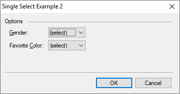
And here is the code:
                                                                        // Resource
#beginresource

#define CB_GENDER                       201
#define CB_COLOR                        202

RadioButtonExample02Dlg DIALOGEX 0, 0, 240, 100
EXSTYLE WS_EX_DLGMODALFRAME
STYLE DS_MODALFRAME | DS_3DLOOK | WS_POPUP | WS_VISIBLE | WS_CAPTION | WS_SYSMENU
CAPTION "Single Select Example 2"
FONT 8, "MS Shell Dlg"
{
 CONTROL "Options", -1, "static", SS_LEFT | WS_CHILD | WS_VISIBLE, 6, 6, 30, 8, 0
 CONTROL "", -1, "static", SS_ETCHEDFRAME | WS_CHILD | WS_VISIBLE, 36, 11, 196, 1
 CONTROL "&Gender:", -1, "static", SS_LEFT | WS_GROUP | WS_CHILD | WS_VISIBLE, 12, 20, 60, 8, 0
 CONTROL "", CB_GENDER, "combobox", CBS_DROPDOWNLIST | WS_CHILD | WS_VISIBLE | WS_TABSTOP, 64, 18, 50, 40
 CONTROL "Favorite &Color:", -1, "static", SS_LEFT | WS_GROUP | WS_CHILD | WS_VISIBLE, 12, 36, 60, 8, 0
 CONTROL "", CB_COLOR, "combobox", CBS_DROPDOWNLIST | WS_CHILD | WS_VISIBLE | WS_TABSTOP, 64, 34, 50, 40
 CONTROL "", -1, "static", SS_ETCHEDFRAME | WS_CHILD | WS_VISIBLE, 6, 74, 226, 1
 CONTROL "OK", IDOK, "button", BS_DEFPUSHBUTTON | WS_CHILD | WS_VISIBLE | WS_TABSTOP, 127, 80, 50, 14, 0
 CONTROL "Cancel", IDCANCEL, "button", BS_PUSHBUTTON | WS_CHILD | WS_VISIBLE | WS_TABSTOP, 180, 80, 50, 14, 0
}

#endresource


                                                                        // Dialog Data
    string              cb_gender;
    string              cb_color;

                                                                        // Main Entry
int main() {
    int                 rc;

    cb_gender = GetSetting("Dialog Examples", "Single Select Options", "Gender");
    cb_color  = GetSetting("Dialog Examples", "Single Select Options", "Color");

    rc = DialogBox("RadioButtonExample02Dlg", "cb_");
    if (IsNotError(rc))  {
      PutSetting("Dialog Examples", "Single Select Options", "Gender", cb_gender);
      PutSetting("Dialog Examples", "Single Select Options", "Color", cb_color);
      MessageBox("Gender: %s\r\rColor: %s", cb_gender, cb_color);
      }
    return rc;
    }

                                                                        // In Dialog Proc - Load
int cb_load() {
    string              s1;

    s1 = "Male Female Other";
    if (cb_gender == "") { s1 = "(select) " + s1; }
    ComboBoxLoadList(CB_GENDER, s1);
    ComboBoxSelectItem(CB_GENDER, cb_gender);
    if (cb_gender == "") { ComboBoxSelectItem(CB_GENDER, 0); }

    s1 = "Black White Red Blue Pink Teal Fusia Purple Violet";
    if (cb_color == "") { s1 = "(select) " + s1; }
    ComboBoxLoadList(CB_COLOR, s1);
    ComboBoxSelectItem(CB_COLOR, cb_color);
    if (cb_color == "") { ComboBoxSelectItem(CB_COLOR, 0); }

    return ERROR_NONE;
    }

                                                                        // In Dialog Proc - Pressed OK
int cb_validate() {
    string              s1, s2;

    s1 = ComboBoxGetSelectString(CB_GENDER);
    if (s1[0] == '(') { s1 = ""; }

    s2 = ComboBoxGetSelectString(CB_COLOR);
    if (s2[0] == '(') { s2 = ""; }

    if (s1 == "") {
      MessageBox('X', "Select a 'Gender'.");
      return ERROR_SOFT | CB_GENDER;
      }

    if (s2 == "") {
      MessageBox('X', "Select a 'Favorite Color'.");
      return ERROR_SOFT | CB_COLOR;
      }

    cb_gender = s1;
    cb_color = s2;
    return ERROR_NONE;
    }
Similar to the checkbox versus list box example in my last blog, the combo box example has significantly less code. The main routine is the same. The load function, however, is considerably different. Each control requires selection items to be loaded and the incoming string needs to be selected. We could load the list and select a string. If the source data is incorrect or empty, the combo box would remain blank. However, we put a little polish on the interface by detecting that there is no incoming selection and adding “(select)” to the list.
During validation, we eliminate the “(select)” option by testing for an open parenthesis and clearing the string. This has the consequence of forcing an error during validation.
If you have already ran the radio button example, then the “(select)” will never appear because gender and color are already set. To test the selection, comment out the lines containing the GetSetting functions in the main() routine.
Conclusion
The combo box is a good alternative to the radio button while reducing code and increasing extensibility. On the other hand, radio buttons give a clear indication as to available options and, for most people, a visual indication that only one may be selected.
While writing this blog, I ran across a useful treatise on visual design selections for various controls. The one for radio buttons is located at https://docs.microsoft.com/en-us/windows/desktop/uxguide/ctrl-radio-buttons. It is worth at least speed read.
In my next blog on checkboxes and radio buttons, I will explore the BS_NOTIFY style and how to manually perform processing for these types of controls.
 Scott Theis is the President of Novaworks and the principal developer of the Legato scripting language. He has extensive expertise with EDGAR, HTML, XBRL, and other programming languages. Scott Theis is the President of Novaworks and the principal developer of the Legato scripting language. He has extensive expertise with EDGAR, HTML, XBRL, and other programming languages. |
Additional Resources
Legato Script Developers LinkedIn Group
Primer: An Introduction to Legato
MSDN UI Development Guidelines
Quicksearch
Categories
Calendar


Feeds
